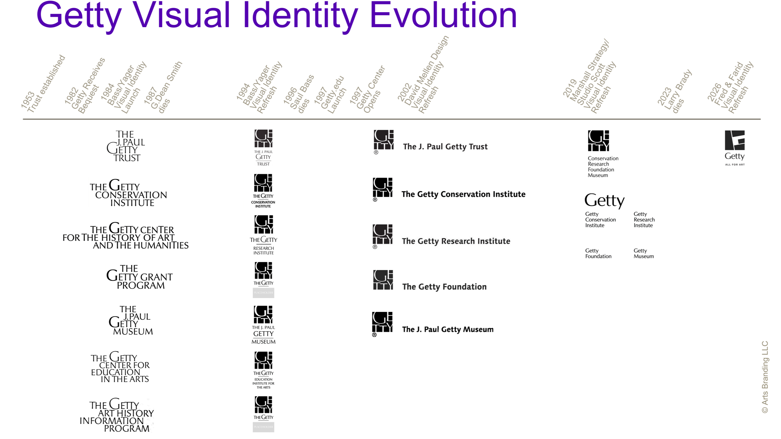
The J. Paul Getty Trust: Creating a Family Resemblance (Copy)
Legacy Project
This project was part of James McNamara’s first job and his first project in the cultural arts, a field that intrigued him and one he would return to years later. He managed this project, compiled and summarized research, provided week-to-week client interaction, worked with the design team on the visual identity process and its components, and managed the accounting of the project. He did this while he was Account Manager at Saul Bass/Herb Yager and Associates.
Special thanks to The Getty Research Institute, Los Angeles, Institutional Archives, Lawrence Brady Typography Development Records, Gift of Lawrence Brady Estate, 2025.IA.35.
Current Situation
When cultural organizations launch a first-time visual identity such as this, the initiative can become a launchpad for the future evolution of strategy and identity.
This was the result for The J. Paul Getty Trust, which has since evolved its visual identity several times, building off the unifying foundation that this branding project achieved. The Getty has evolved its brand strategy over the decades from a family of several programs to a single organization with four programs.
Changes in the Los Angeles, national, and international arts landscape; changes in Getty management; changes in the organization’s venues and their use; consolidation of programs and their effect on brand architecture; and prioritization of different audiences over time, all necessitated updates to how the Getty has spoken about itself and looked in new cultural environments.
Original Situation
The Getty Trust Identity Project Team included Harold M. Williams, Founding President and CEO; Luis Monreal, Founding Director, Conservation Institute (joining later, once appointed); Kurt Forester, Founding Director, Center for the History of Art and the Humanities; Deborah Marrow, Founding Director, Grant Program; John Walsh Jr., Founding Director, Museum; Nancy Englander, Director of Program Planning and Analysis; and Patrick Dooley, Design Manager.
Established in 1953, the J. Paul Getty Trust (originally, The J. Paul Getty Museum Trust) received its bequest in 1982 after J. Paul Getty died. The Trust now faced the enviable obligation to spend 4.25% of its approximately $1.6 billion endowment each year, under federal tax law at the time.
Over the decades, this enabled the Trust, through its four programs, to become a dominant, but not domineering force in the art world. It has enhanced its collection, and created signature and ground-breaking art initiatives and exhibitions; funded numerous municipal, state, national, and international arts organizations, and is regarded as one of the go-to research centers, regularly advancing the art field. And then there’s the Getty Center, Los Angeles’ own art acropolis on the hill, a bold move in its inception and creation, and now a beacon for tourists and Angelenos alike. But we’re getting ahead of ourselves; this project started well before all of that...
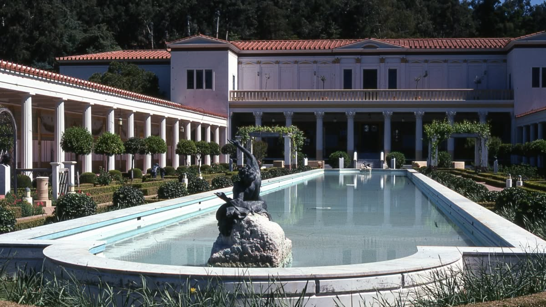
At the time, the Trust and the programs were separated by physical distance (facilities in Century City, Santa Monica, and Pacific Palisades), unique missions, and differences among them over the relative importance of each. The Trust’s immediate goal was to begin creating a new, more public face for the Trust and its programs, beyond the only public face audiences knew at the time: the 1974 Getty Villa Museum in Santa Monica (then called The J. Paul Getty Museum).
Creative Strategy
Keep in mind that this project was pre-brand strategy, pre-digital, pre-Getty Center, and pre-internet. We started with some qualitative research: interviewing project team members and additional managers, reviewing and analyzing existing communications materials, and discussing with the Trust its goals for the future. The Trust’s key goal was to unite all Getty programs in a single physical location, including an additional art museum. By 1984, the Trust had announced its intention to build the Getty Center in the Brentwood section of Los Angeles, and selected Richard Meier and Partners as its architect. Harold Williams and the Trust wanted a visual identity that would coalesce the Trust’s family of programs into a single arts mission, with each program responsible for its part of that mission.
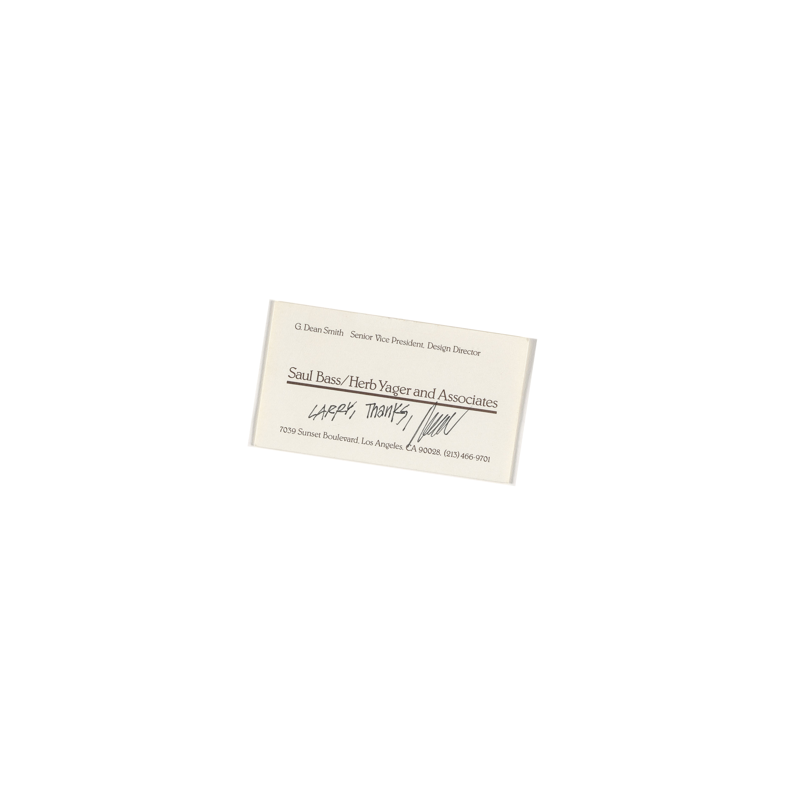
The Bass/Yager Getty identity design team included Saul Bass, creative director; G. Dean Smith, senior vice president, design director; and Jay Toffoli, senior designer. Bass’ design ethos for visual identity (corporate identity as it was then known) was: symbolize, don't illustrate; meaning, design visual symbols that speak to a broader, perhaps abstract idea that an organization wants to convey about itself. Given this, and not surprisingly, virtually every Bass/Yager visual identity used symbol and word components. In the Getty’s case, this meant conveying the idea of parts coming together to create a greater whole, against the visually rich Getty Museum of the time: a recreated Roman-style villa, filled with Roman, Greek, and Etruscan antiquities, 18th-century French furniture and decorative arts, European paintings, and a newly purchased, highly prized medieval and early Renaissance illuminated manuscripts collection.
In design explorations, typically, the entire design staff was engaged to create symbols/icons for identity projects. The idea was to overwhelm clients with the scale of the design exploration, reducing the likelihood of needing further ideas (budget did not allow for more anyway). The Getty was no exception. Soon, the studio was filled with numerous 4’x8’ boards filled with hundreds of black & white symbol ideas. A parallel stream of ideas for typography was also completed. Bass, Smith, and Toffoli winnowed down the symbol and type ideas to those that showed the most promise for further refinement based on the Getty’s goals and Bass/Yager’s design strategy.
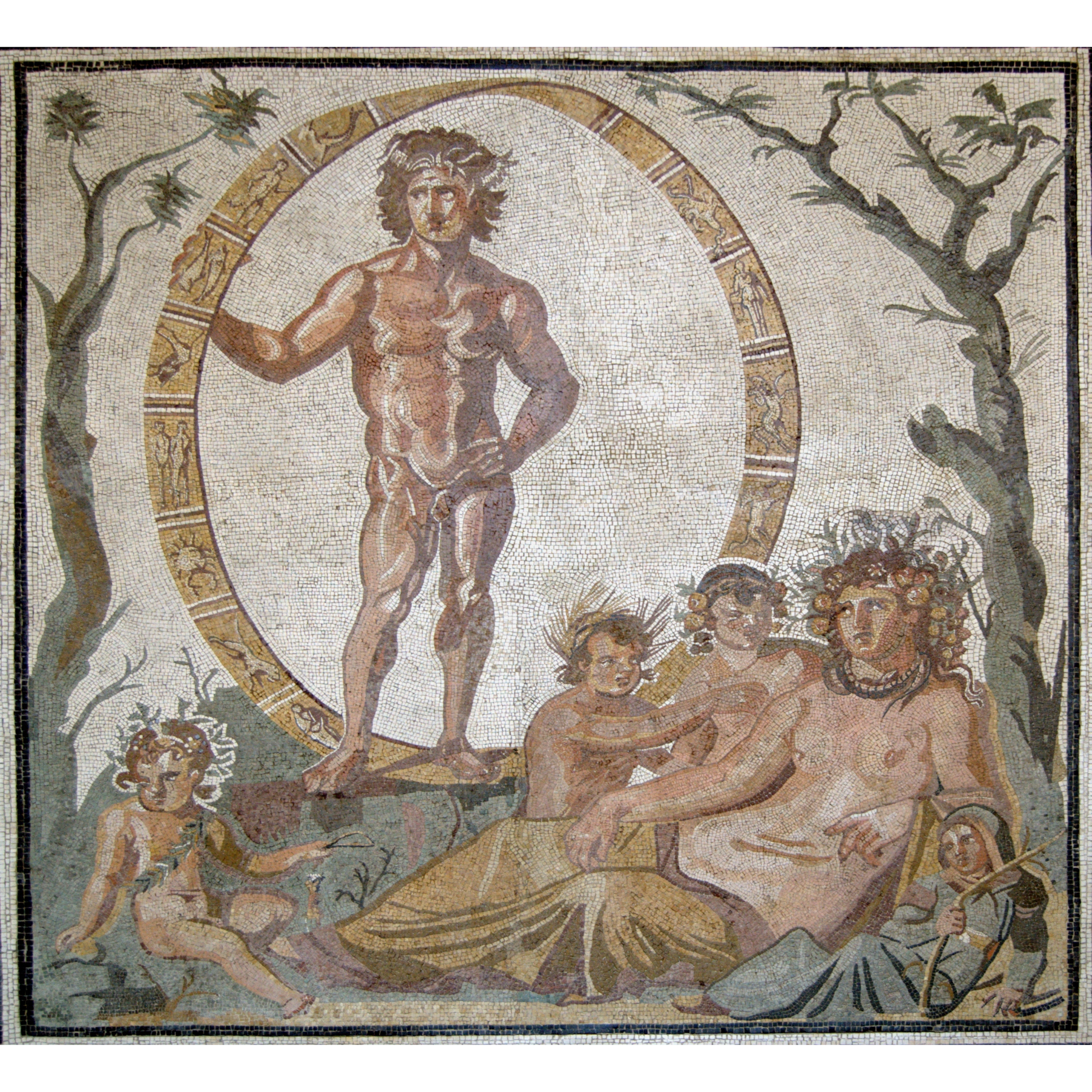
One of the symbol ideas that rose to the front was a drawing of a Mobius ribbon. An ancient Roman symbol, even before Mobius’ time, that symbolized the key idea of 4-in-1: the four main Getty programs evolving around the central Trust. The most famous surviving example of this symbol is a 3rd-century CE mosaic found in the Roman villa of Sentinum, Sassoferrato, Italy, which depicts the god Aion holding a cosmic, twisted hoop. Some call it an infinity circle; this twisting, continuous band visually illustrated that time has no beginning and no end.
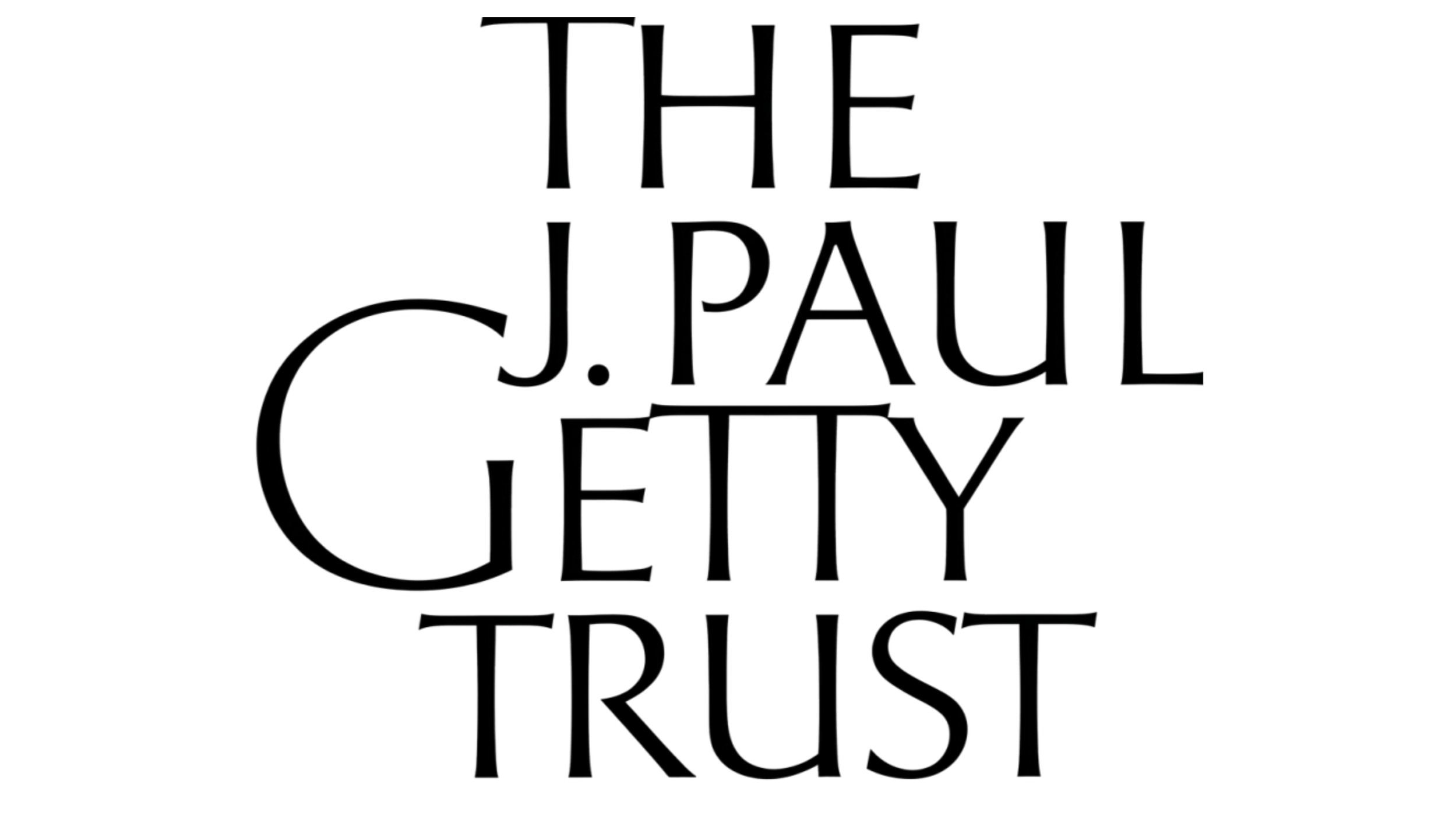
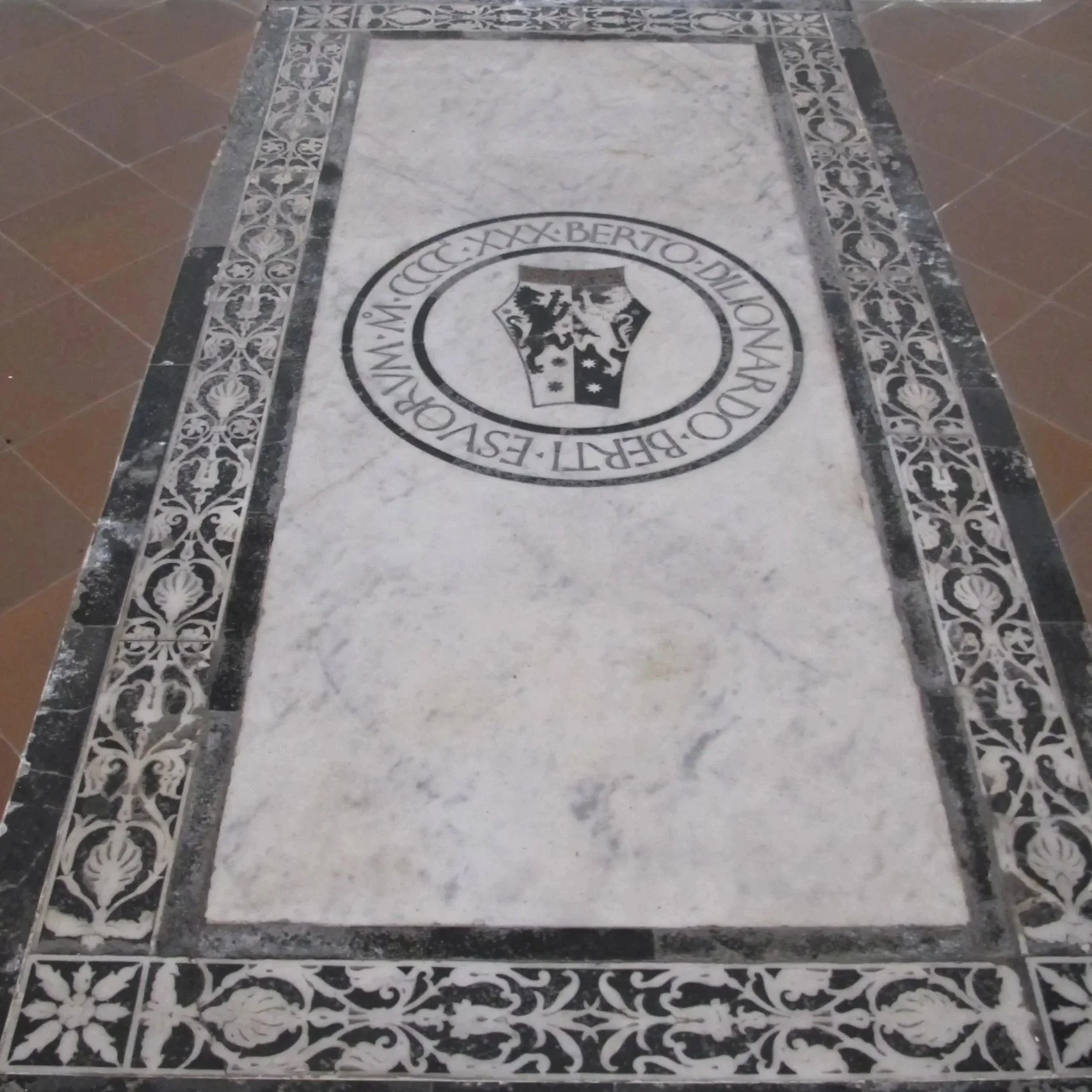
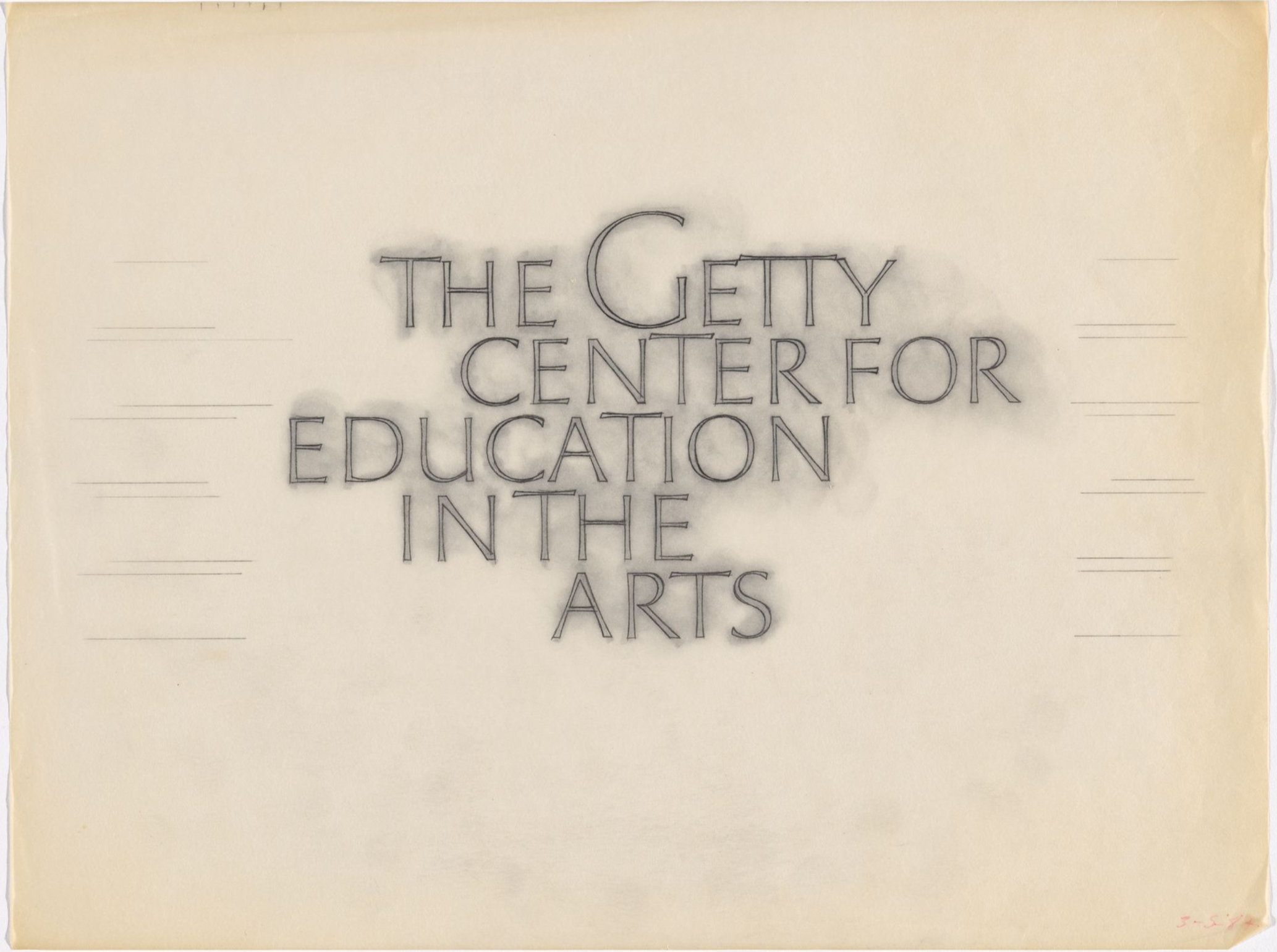
As part of this phase of exploration, Bass/Yager, and specifically Smith, engaged Lawrence (Larry) Brady, a prominent U.S. typographic designer and calligrapher, in a contractual role to further explore typeface ideas in general. While none of Brady’s symbols or wordmarks fit the bill, one of his hand-drawn type treatments based on ancient Roman carvings did. Brady felt his design was too close to Hermann Zapf’s Optima typeface, so he suggested that the Getty just use Optima. Related, Zapf was interested in calligraphy and Italian printing and lettering history. He was particularly interested in lettering design, where strokes subtly widen as they reach terminals without ending in serifs. He was inspired by the tombstones in the Basilica di Santa Croce cemetery, Florence. Bass and Smith assured Brady that his design was original enough to avoid confusion. They wanted him to create a unique and proprietary typeface for the Getty.
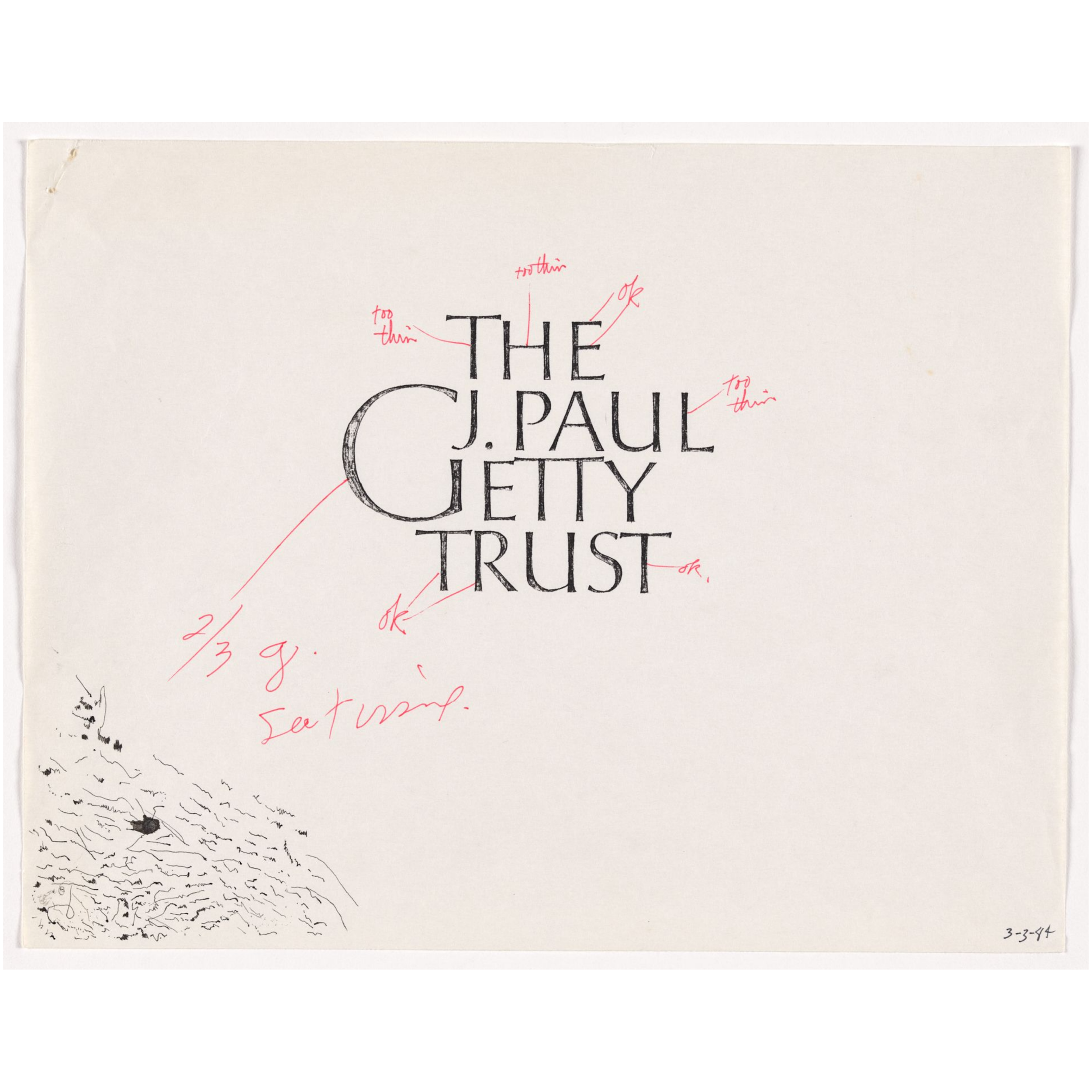
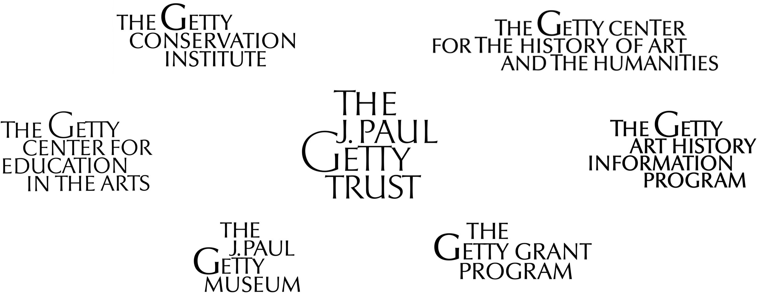
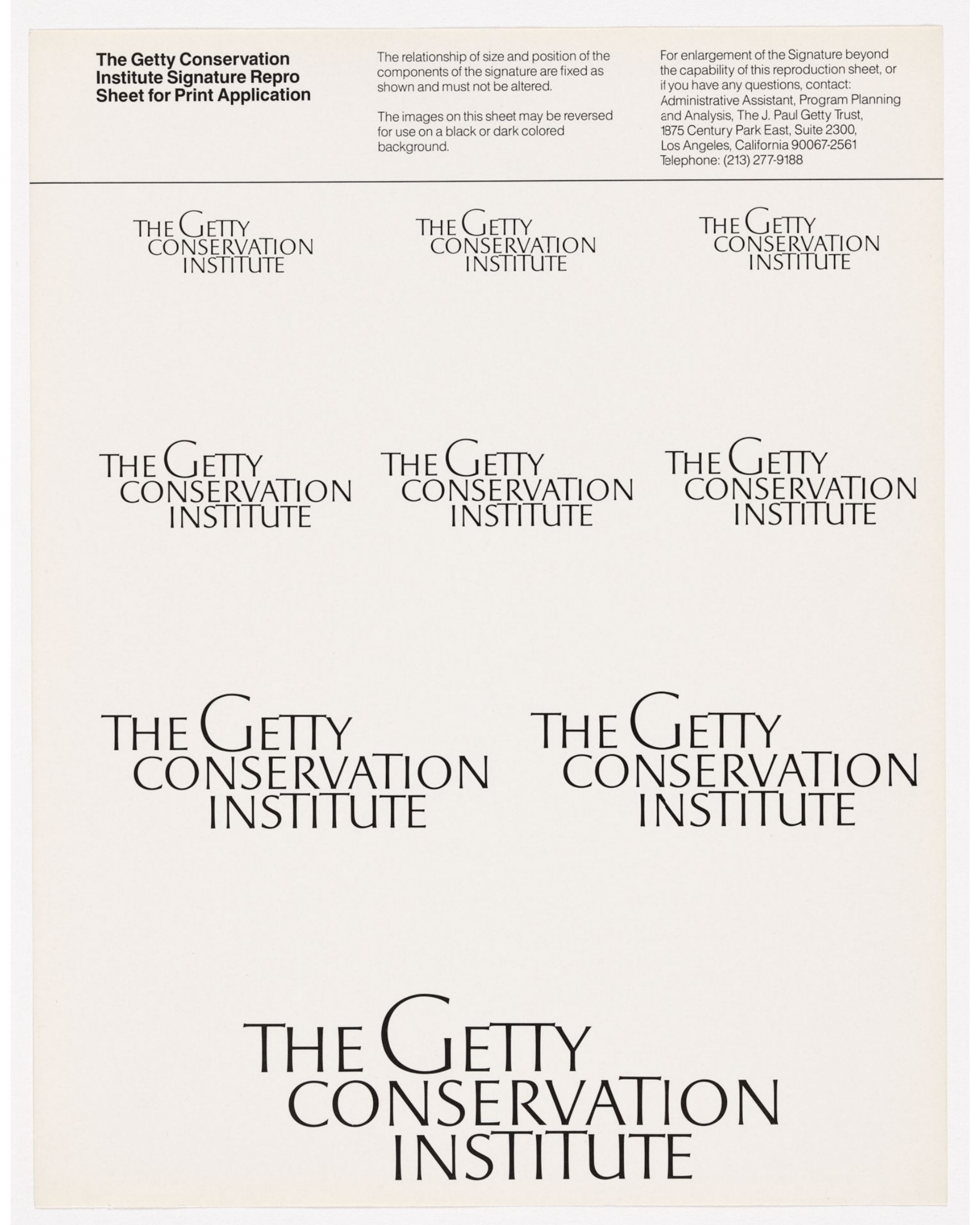
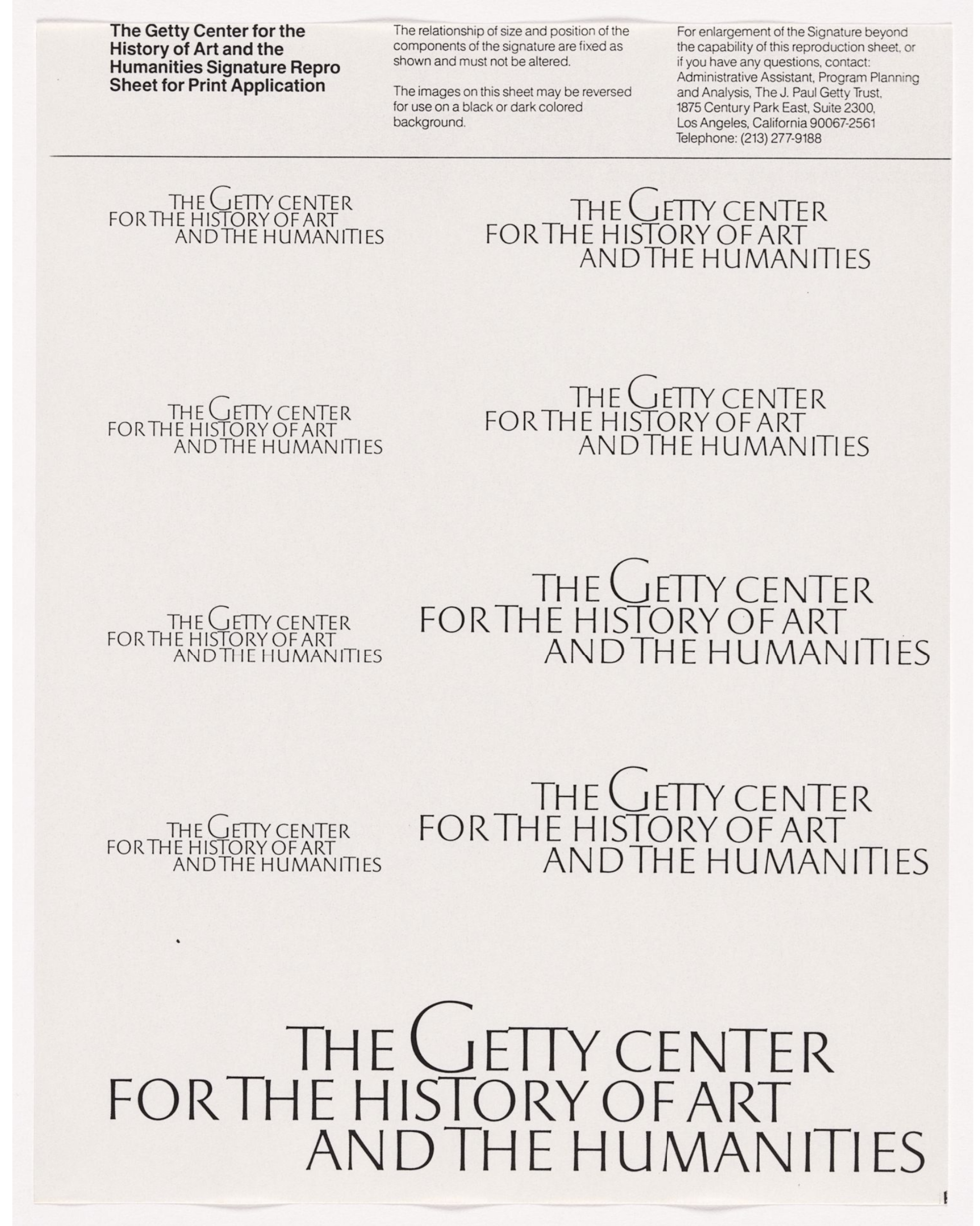
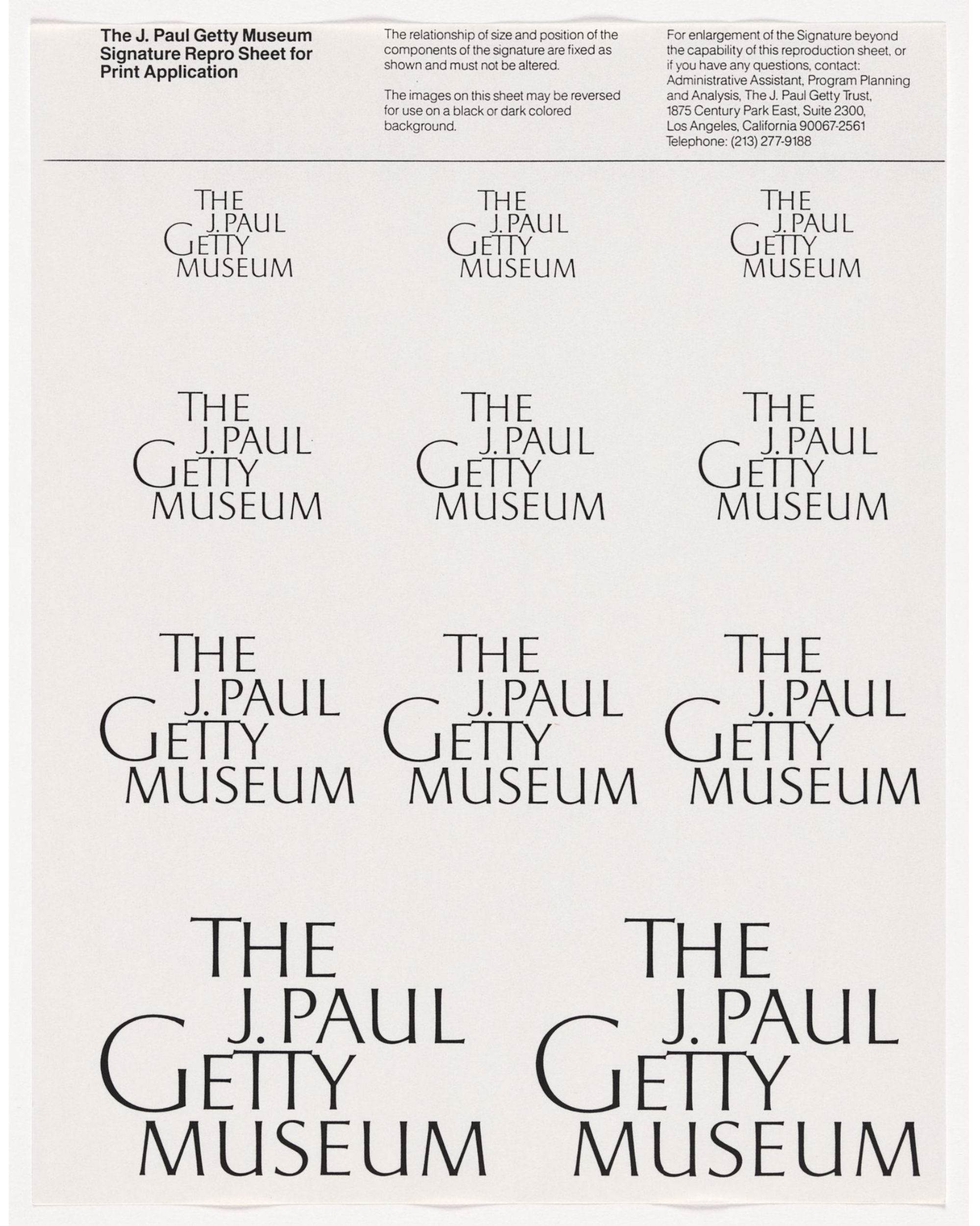
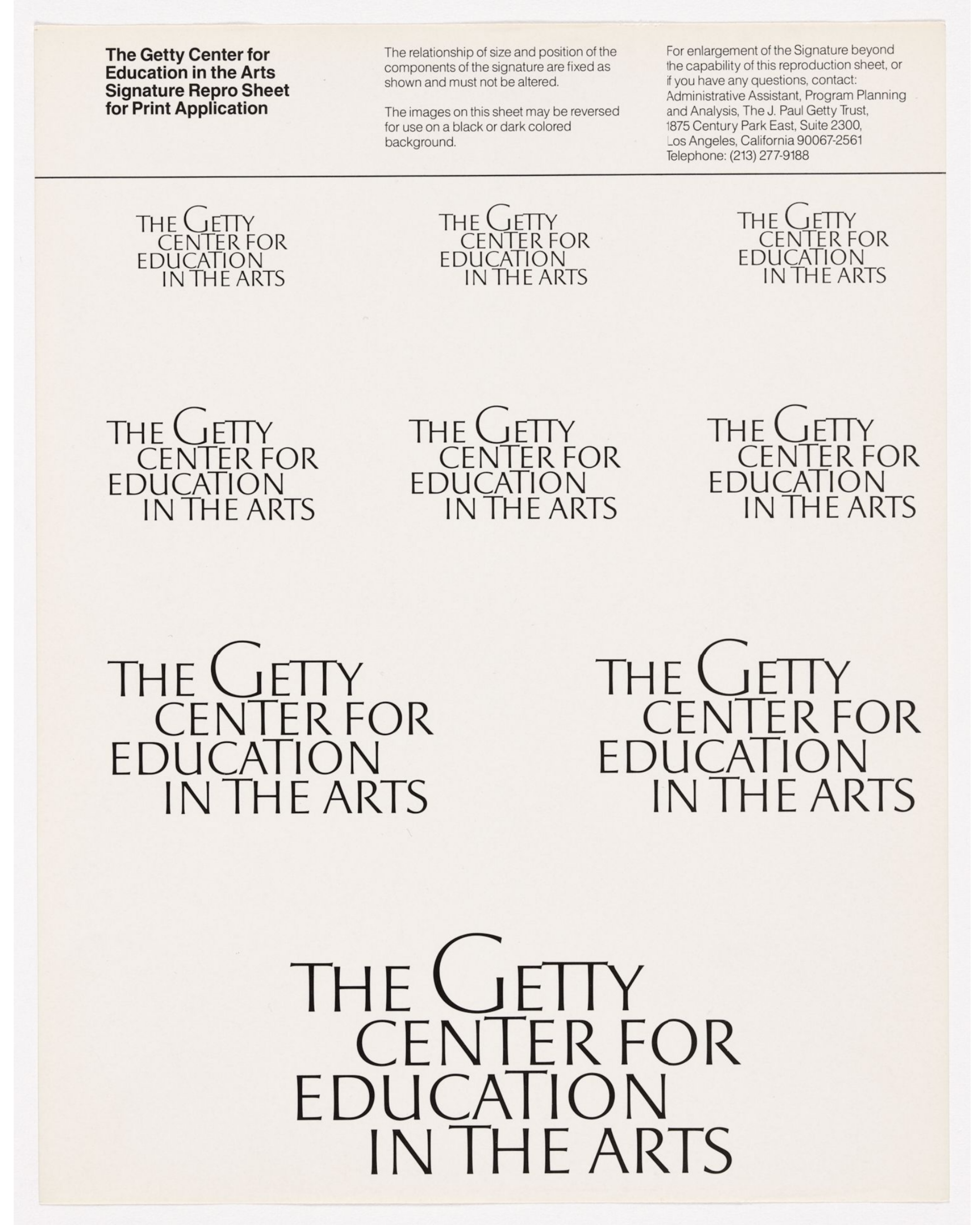
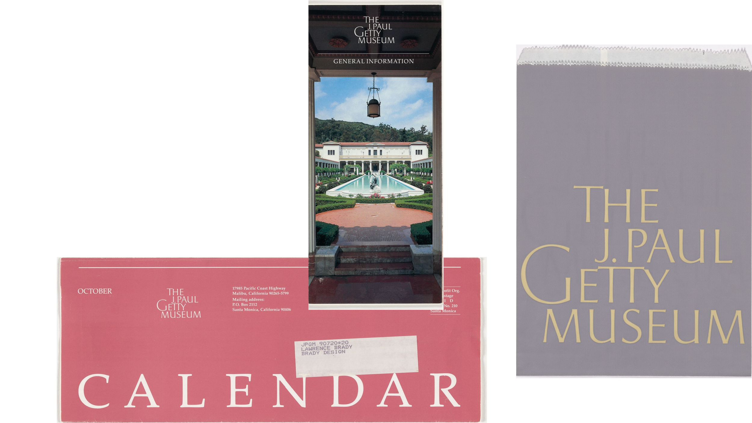
The Bass/Yager design team refined the 4-in-1 symbol (making the lines look carved to match Brady’s typeface). For the typeface, they suggested and guided scores of refinements to Brady for the Getty logos in letter construction (height and width); in letter spacing (side bearings), kerning, and leading; in adding ligatures; and in raising the arms of specific capital Ts throughout the logos. Brady paid particular attention to Getty capital Gs in the logos, using raised caps. Developed centuries after Rome’s fall, raised caps (and dropped caps) were invented in the Middle Ages in illuminated texts by monks and scribes who needed a way to visually organize text and signal the start of new paragraphs or sections. Their use in the Getty logos was another subtle reference to the Getty’s medieval and early Renaissance illuminated manuscript collection. Ultimately, Brady hand-drew 89 letters and ligatures of varying heights (for visual variety options), numbers, and punctuation marks. The overall effect is a font of classic inscriptional capital letters.
Brady’s calligraphic and the Bass/Yager design team’s layout skills were on full display in the composition and arrangement of words within the logos. This was also the time to look at the nomenclature for each program name and the names overall. Each logo is unique, not following the usual norms of brand architecture, which uses standardized word placement and extensions. Each logo was designed to have its own balance, rhythm, emphasis, and movement.
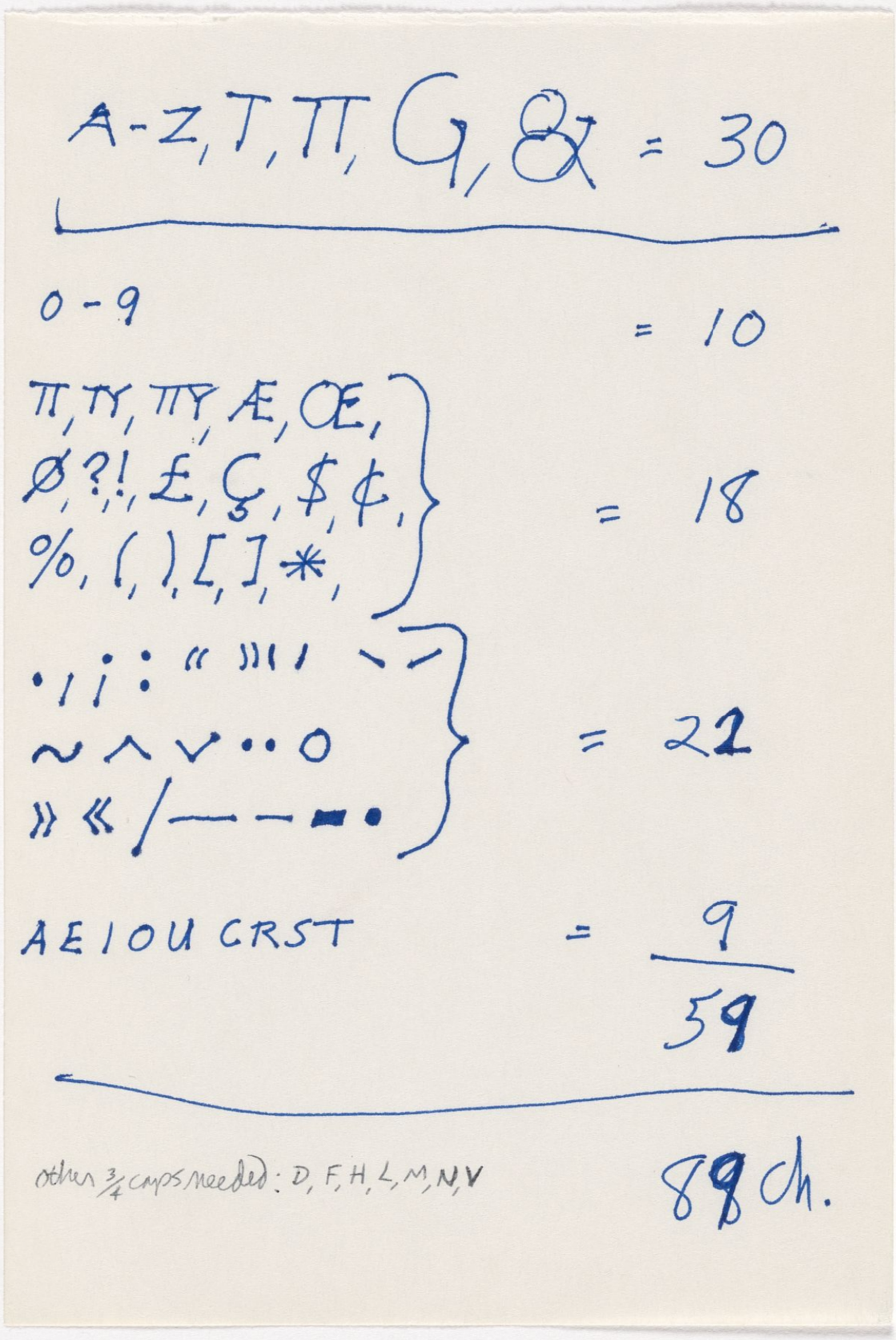
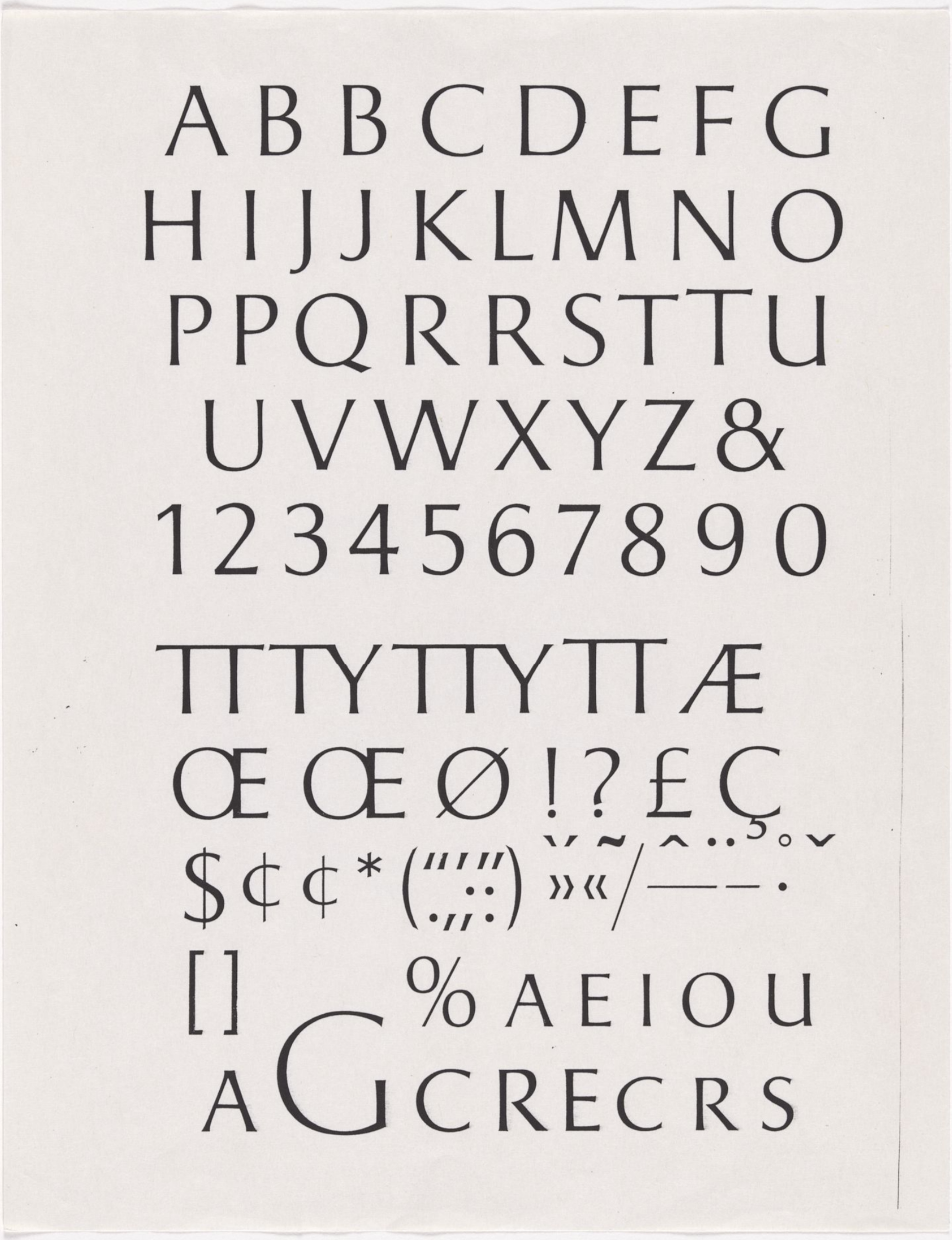
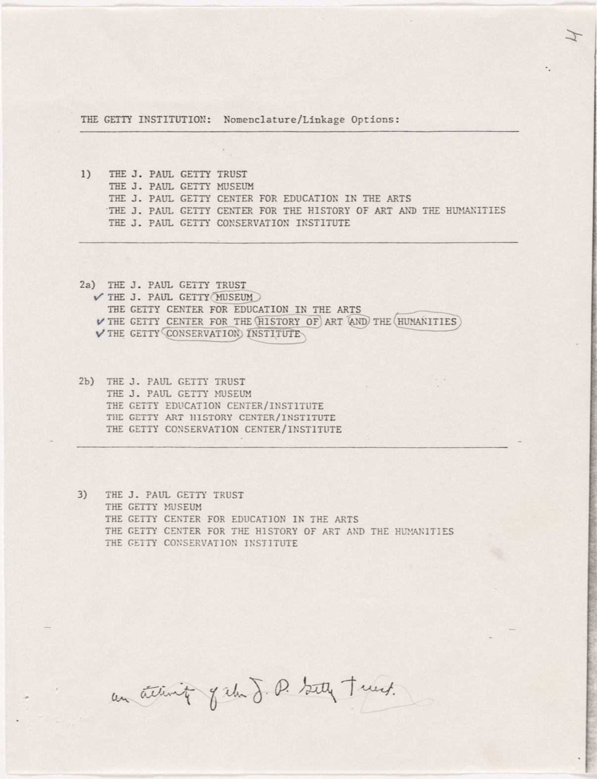
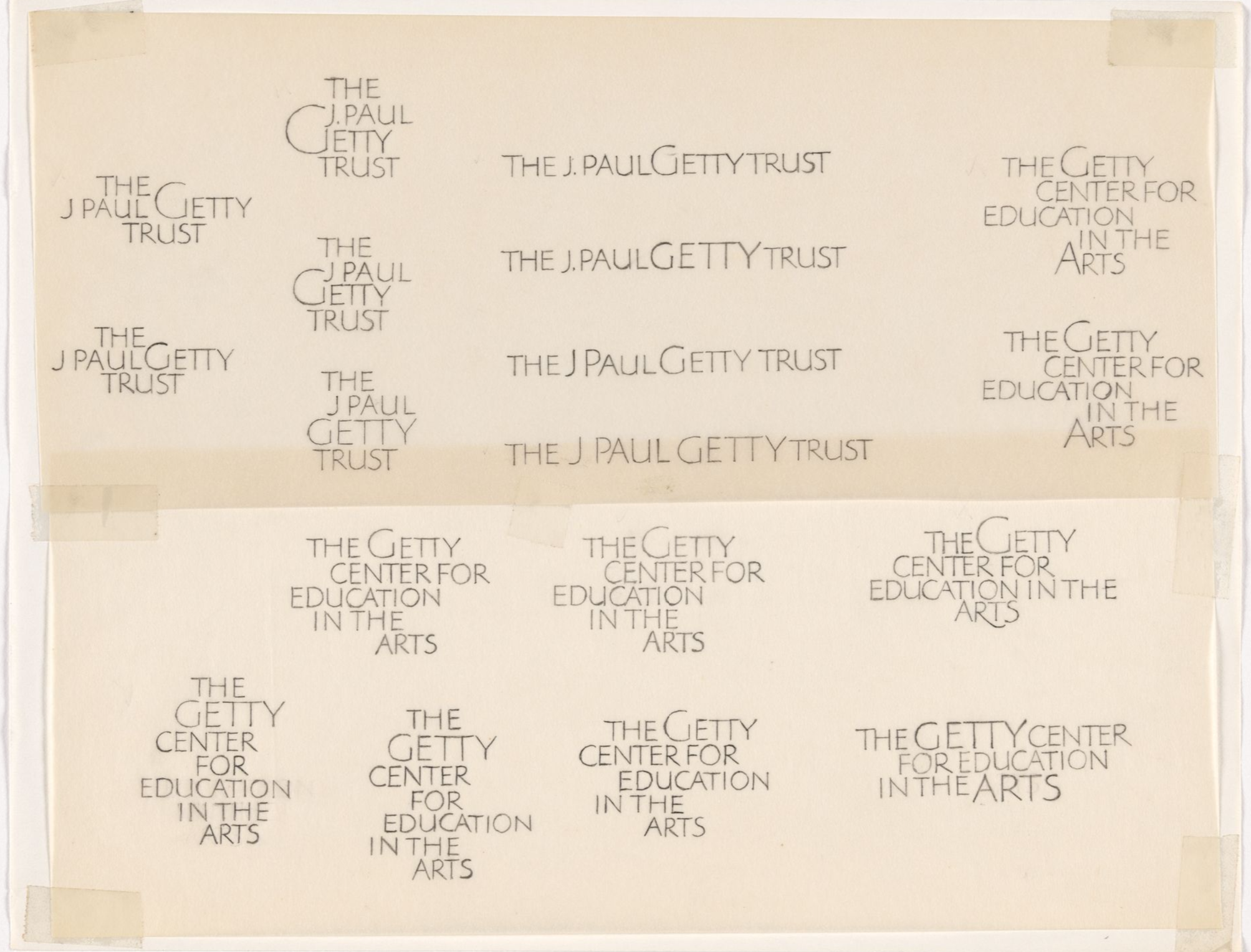
In the Bass/Yager office, major-presentation days were design theatre. Thick black velvet theatrical drapes lined the walls of the huge studio. The room neared soundstage quiet. The 4’x8’ exploration boards lined three walls of the room with an enormous conference table and chairs at the center. As Bass presented around the room to the Getty team, someone from the Bass/Yager design team would unveil the boards, leading to the final wall with the three finalist visual identities on three sets of boards. A room full of symbols, ceiling to floor, combined with the finalist boards, was indeed dazzling. Bass would then present the first two finalists, highlighting each of their advantages and disadvantages, ensuring the latter outnumbered the former. The finalist recommendation had no disadvantages, only advantages. From the Bass/Yager design team’s view, it solved all of the strategy, communications, and creative issues and challenges. The finalist recommendation was the 4-in-1 Mobius symbol, combined with Larry Brady’s Roman capital letters.
After a Bass presentation, there were usually a few moments of quiet, no one knowing who should speak first. Some would eventually break the silence with comments on the breadth, depth, and thoughtfulness of the exploration and presentation. Others would agree that the finalists should have been selected as such. Remember, the Getty team included some of the leading professionals in the art field of the day. Each evaluated visuals of all kinds every week.
John Walsh, head of the Museum, was the most expressive from the Getty team. He too praised Bass/Yager, paused, and pivoted. He prefaced that he understood the underlying meaning and influences of the Mobius ribbon symbol; however, respectfully, he found it a bit mechanical and camera lens-like, unrelated to the elegant strokes of the letterforms and dynamic arrangement of the words within each logo. He felt the symbol didn’t add enough and was perhaps taking focus from the wordmark logos. Bass listened carefully and offered that the symbol could be redrawn to heighten movement and dimension. Walsh was reluctant. Surprisingly, what happened next is forgotten, as James had never seen a client not accept a Bass/Yager recommendation, nor a Bass/Yager identity without a symbol. The ultimate result is clear, however.
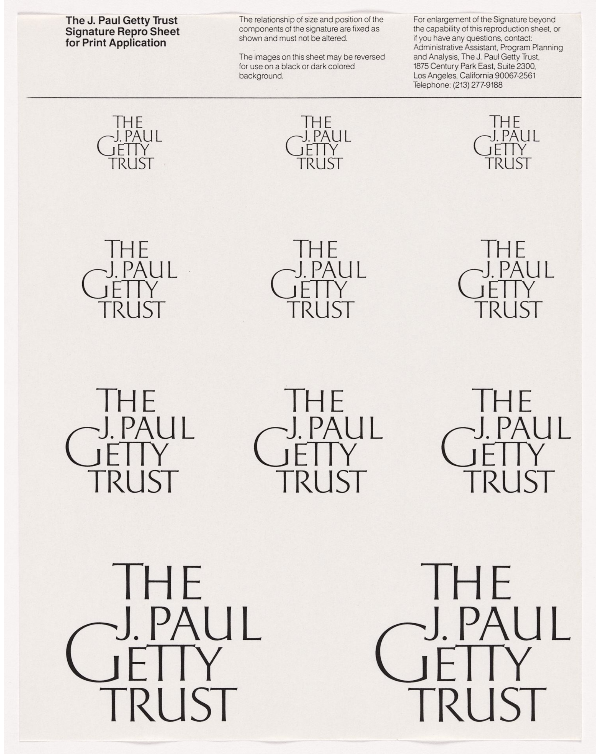
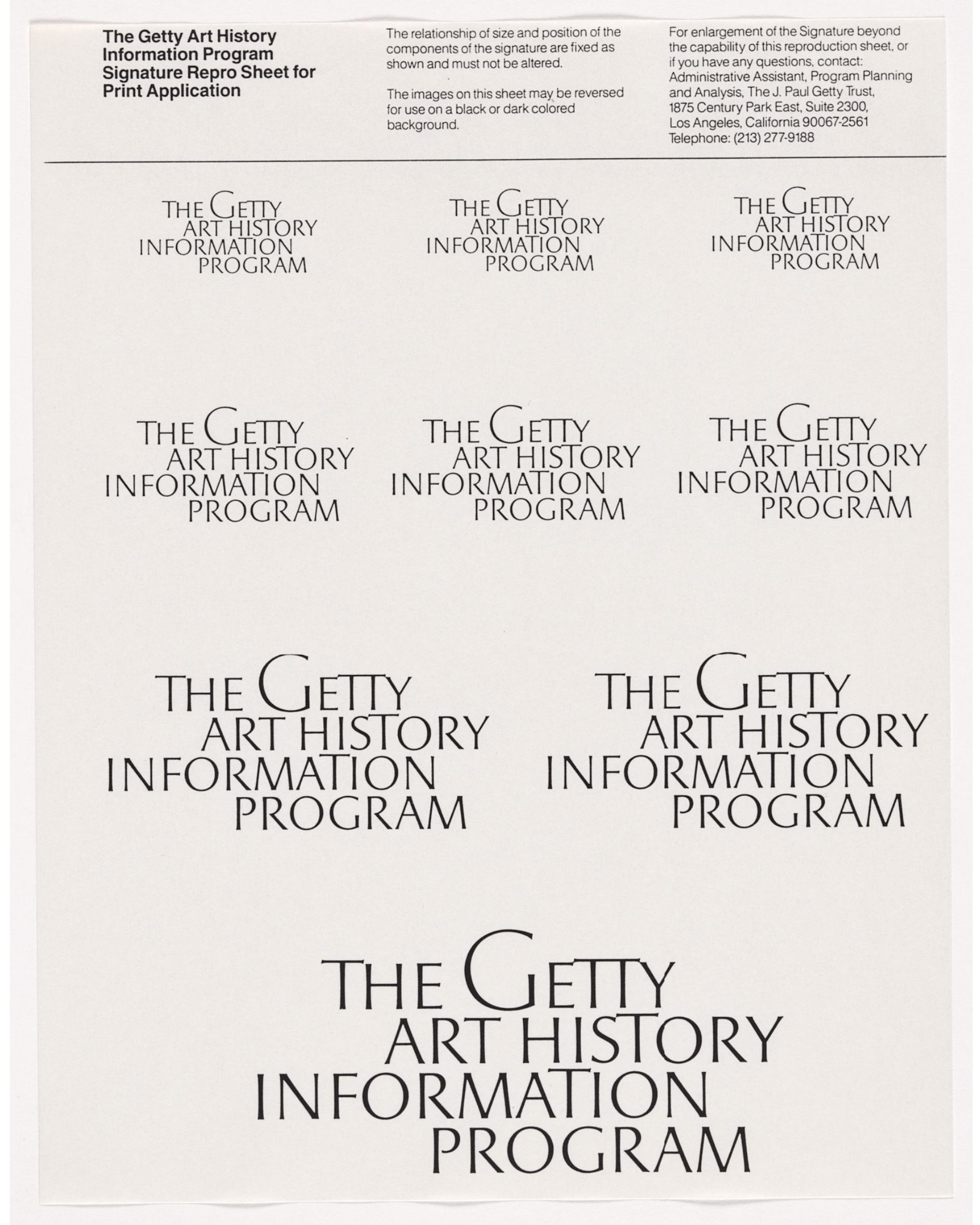
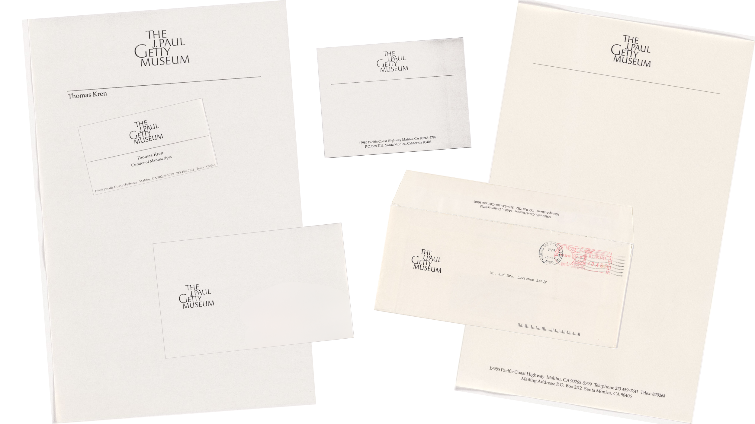
Welcome back to the age of only paper! To help launch the new Getty visual identity, James supervised the creation of logo repro sheets as final art for the Trust and programs. For those unaware, you would cut out a logo and use it directly on a production board layout, or you could make a stat of the largest logo from a sheet to the exact size needed for a layout. James also coordinated final art for the print stationery system that included regular and engraved letterhead, envelopes, note cards, labels, and business cards for the Trust and each program – well over 50 final finished art boards, masterfully supervised by Bass/Yager’s incomparable production manager, Nancy von Lauderbach.
Benefit
The Getty of that time, some from the programs, a little from the Trust, but especially from the Museum, was gaining increased prominence and a higher public profile. The Trust would gain increasing public visibility as it issued periodic press releases on the progress of The Getty Center that it would plan, build, and promote over the coming decade. The public was hearing more than ever from the Getty.
The new visual identity allowed the Getty to now look like the prominent, established, professional, and multi-layered organization that it was and would continue to be. The visual identity reflected the level of aesthetics and artfulness of the programs that the Getty’s logos now conveyed.
The visual identity effectively communicated preeminence without pretension, contemporary style without trend. Thoughtful program names, nomenclature, and brand architecture provided a readily understood system and a coherence and relationship among the Getty programs and Trust.
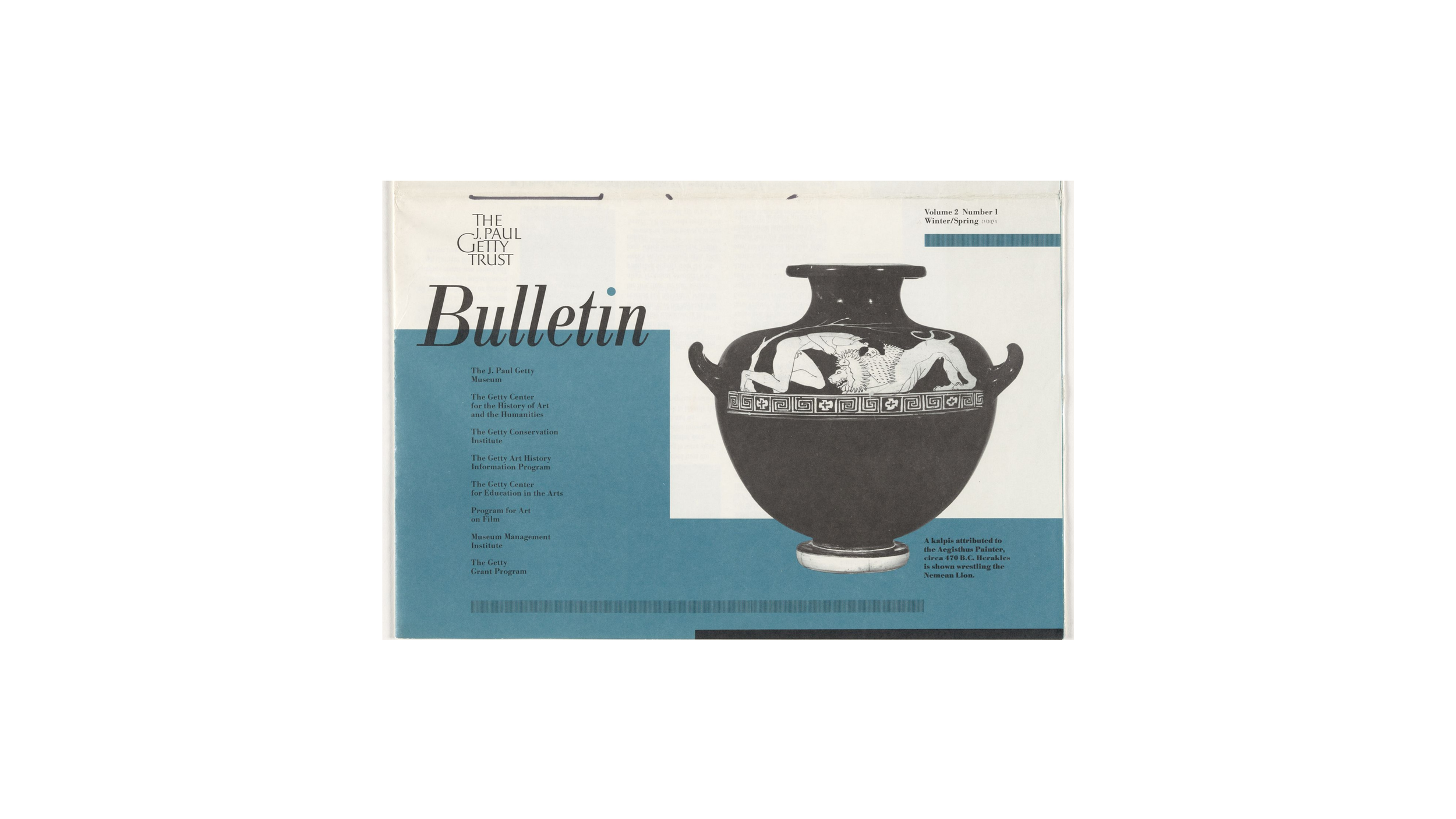
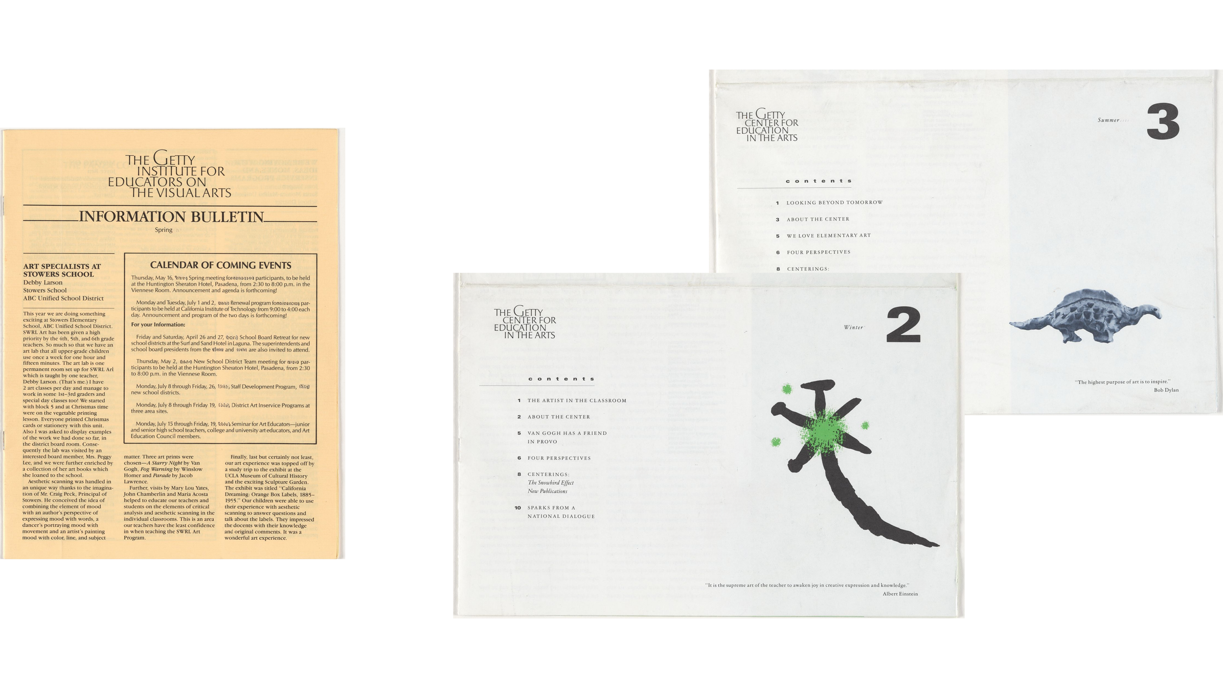
Print materials from stationery to bulletins, and brochures to calendars and commerce all now looked like they belonged to the same family while retaining some individuality.
Result
John D. Berry, a typographer, book designer, design writer, editor, and typographic consultant for CreativePro, wrote about Larry Brady and the Getty visual identity:
“Brady’s own type designs include the titling font he designed in the 1980s for The J. Paul Getty [Trust] in Los Angeles. He was commissioned by Saul Bass[/Herb Yager and Associates] to work on the [Trust’s] identity, and went through an enormously long and complex series of sketches, ideas, and changing directions (which he detailed amusingly for a San Francisco audience) before coming up with a typeface that took its inspiration from historical hand lettering as well as from the tapered, serif-less letters found in some inscriptions in Renaissance Italy . . .”
“Although the Getty planned a new identity when they moved into their new home atop a hill in Brentwood, in the 1990s, they ended up continuing to use Larry Brady’s typeface for signage in the new location, and the new logo, although varied in form, is clearly based on the same letters. ‘I was quite surprised to see the new logo direction for the new Getty,’ said Brady. He had been assured by Saul Bass, at the Aspen Design Conference in 1994, that while his design had worked just fine over the past ten years, it was ‘too recessive’ for the ’90s. Imagine Brady’s surprise when he saw his old letters in the newly designed logo.”
Graphic designer Christian Annyas calculated that the average lifespan for a Saul Bass/Herb Yager and Associates logo is 34 years. Well, the Getty logos lasted 9 years, 17 years, or 41 years, depending on what parts you calculate. How does Bass/Yager refreshing its own work affect the calculation?
One conclusion is obvious, however: Larry Brady’s hand-drawn Getty alphabet lasted as part of the Getty visual identity for over 4 decades, and is still used in The Getty Center’s building signage system today.
The Getty visual identity has evolved from a family of “cousins,” through “parent/siblings” phases, to what would now be called a “single brand strategy,” the most effective and efficient of brand strategies. Hey, that only took over 40 years, but the Getty had to get there in its own time.