 New York City Center opened its new season with improvements to its building exterior and a newly renovated interior. The architectural style of their Moorish Revival building reflects the theme of its original occupants.
For those unfamiliar, City Center, a former Mecca Temple of the Ancient Arabic Order of the Nobles of the Mystic Shrine (Shriners) was converted into New York’s first performing arts center in 1943.
Since then City Center has become a premiere venue for dance and musical theatre, presenting and producing acclaimed programs in each of these genres. Along with improved seating and amenities, an additional goal of the renovation was to uncover the lavishly colored and beautifully detailed Moorish interior.
For ease of upkeep the interior was covered over in white paint in the 1940s. The collective renovations have dramatically improved, both literally and aesthetically, the physical experience of the venue.
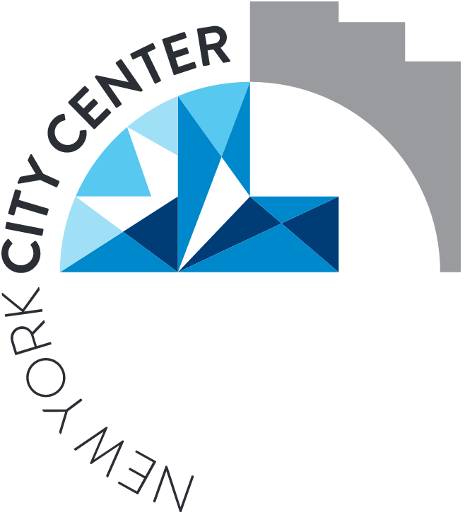
Along with its grand reopening, City Center is also launching a new graphic identity whose icon combines the shape of its building facade and a Moorish design detail (look closely, you can see stylized Ns and Ys) for use on all digital and print materials. Truth be told, I’m not a big fan of basing arts organizations’ graphic identities on the buildings that house them.
Using a visual reference to one’s building is understandable though. In fact, arts brands are in one of the few fields (I can’t actually think of another) that are always linked to their buildings. In many cases the building is an integral part of the experience of the arts brand. Additionally, since City Center is a performing arts center, it would be difficult to visually reference only one arts genre.
So, what’s the big deal? Well, I think a graphic identity should reflect an important idea about what’s attractive about an arts organization on its own merits, not on those of its building. That said, this practice happens regularly: arts groups often take their identity cues from their buildings.
Prior to this new iteration, and in full disclosure, I led the team that created City Center’s previous brand strategy, positioning, and graphic identity that did focus on a key idea: a dynamic center of live performance. You might conjecture that I’m feeling a bit disappointed on their replacing an identity that I helped create, but not really. As I indicated, this renovation really does dramatically enhance the experience of the venue, so much so that a new identity seems completely appropriate given the immensity of the change.
So, what’s an arts organization to do? Should it use its building as part of its visual identity or not? To answer this:
• First, I’d do some research on where your building ranks in importance in the experience that audiences have at your venue. Note, audiences could also include donors, educators, and other community stakeholders.
• Second, if your building ranks low in importance then concentrate on an identity that speaks to a differentiating aspect of the experience you want audiences to feel when attending or visiting your organization. If your building ranks important to audiences’ perception of your organization, consider ancillary images of your building in promotional materials instead of in your identity.
• Third, if you believe that using an aspect of your building’s architecture in your visual identity is critical then consider an identity that goes beyond mere representation to one that is graphically simple and impactful.
UPDATE. Jonathan Denholtz’s (formerly of the California Academy of Sciences) reaction to this essay was so spot on that I had to share it as an addendum.
He writes, “I ran interactive media at the California Academy of Sciences during the relaunch of its brand and the opening of its new $500 million facility in Golden Gate Park in 2008. Undoubtedly, the building itself was (and continues to be) a major draw for the visitor.
The new logo however stands alone as a strong graphic icon that’s easy to integrate across collateral and media. A building was not used because the organization, itself, is so much more than the building – there’s a scientific research team, an educational outreach team, i.e. the mission of the organization extends far beyond the constraints of its physical structure
That all said, the logo has a strong organic feel to it and does indeed integrate elements of the building – the distinct curves of the living roof. You wouldn’t know this from simply looking at the static logo. However, we produced an animation that started with a gestural outline of the building, then separated the curves of the roof which, in turn, morphed into the new logo.” The animation that Jonathan describes is in the following opening advertisement at around 3:12
2 comments
Jonathan Denholtz says:
Sep 27, 2011
I ran interactive media at the California Academy of Sciences during the relaunch of its brand and the opening of its new $500 million facility in Golden Gate Park in 2008. Undoubtedly, the building itself was (and continues to be) a major draw for the visitor.
The new logo however stands alone as a strong graphic icon that’s easy to integrate across collateral and media. A building was not used because the organization, itself, is so much more than the building – there’s a scientific research team, an educational outreach team, i.e. the mission of the organization extends far beyond the constraints of the physical structure
That all said, the logo has a strong organic feel to it and does indeed integrate elements of the building – the distinct curves of the living roof. You wouldn’t know this from simply looking at the static logo. However, we produced an animation that started with a gestural outline of the building, then separated the curves of the roof which, in turn, morphed into the new logo.
ObjectIDEA says:
Sep 26, 2011
Cultural institutions are so rich in identity (collections, performances, educational programs, renowned staff, public venues…) that indeed they often default to using the building as a graphic brand. It’s a way of “packaging,” I suppose.
When the building possesses an architectural signature, and therefore a high recognition factor, I think it’s safe to adopt the institution’s physical expression into a graphic mark for the reasons you cite above. No harm/no foul. At least it makes sense to people?