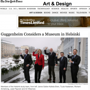
 Back in January, “Helsinki announced that it has commissioned the Solomon R. Guggenheim Foundation to undertake a feasibility study to examine the possibility of building a new Guggenheim Museum in Finland.”
While around for some time, museum branding is still in its infancy, but the Guggenheim is at the forefront. Do you need five museums to create a global museum brand? No, you can do it with one. What the Guggenheim understands is that each of its museums must embody the Foundation’s original goals and must embody the attributes that are true and unique to the Guggenheim brand.
From a cultural arts branding view, the Guggenheim has always held a fascinating place. On the one hand, it stands for authenticity, being a collections visionary, iconic architecture, world-wide presence, and non-profit entrepreneurialism. On the other hand–for some–it stands for crass commercialism, selling-out, and breaking the rules. Let me state from the outset: I’m on the side of art. More art for more people is always the right label.
So what enables the Guggenheim to do what it does with its famous brand? Well, I think it’s a combination of factors. Authenticity is certainly part of it, including the Foundation and its history, the fabulous modern and contemporary art collections, and the iconic, often avant-garde, architecture. Another aspect is the Foundation’s vision for the mark it wants to leave on the world through its museums. And, an important aspect is the business savvy that the Foundation brings to the table that, while shaky in the beginning (e.g. Guggenheim Las Vegas), has now taken on more of a licensing and management model that franchisers such as hospitality brands use. The key is that the Guggenheim provides programming and management, and most vital, approval on important touchpoints such as architecture and how their brand is used.
But the ultimate reason the Guggenheim can use its brand in the way it does goes all the way back to the museum’s inception with the Foundation’s opening its “Museum of Non-Objective Painting” in 1939 to showcase Solomon Guggenheim’s eclectic, if not eccentric, art collection. In other words, effective branding is honed over time and reflects the original premise, the original idea, the reason for being. Showcasing contemporary art in 1939 was certainly risky, envelope-pushing, and trail-blazing at the time – attributes that are still endemic to the Guggenheim brand today.
![]() As a related aside, the Guggenheim’s newish graphic identity also harkens back to the Foundation’s roots with a typeface that is similar to the one used on the iconic Frank Lloyd Wright facade of the New York museum.
As a related aside, the Guggenheim’s newish graphic identity also harkens back to the Foundation’s roots with a typeface that is similar to the one used on the iconic Frank Lloyd Wright facade of the New York museum.
